Lessons learned from building reusable UI components

Writing reusable components that work seamlessly across different platforms such as web & react-native, or different browsers and devices tends to have more than a few footguns associated with them. From API design to accessibility there’s a huge spectrum of edge cases to be handled while building a component that suffices a variety of use cases.
I’ve been writing reusable components in React for a while now. Writing components, designing developer-friendly APIs & brainstorming about how the components will suffice the product’s use cases are intriguing problems to solve.
Intro
Currently, we are developing Razorpay's design system called Blade which we've been iterating over for quite a while now. It’s open source so you can check the source here.
Previously I've helped build Renderlesskit (now AdaptUI) and I've also worked with and contributed to other design systems/component libraries like ChakraUI & Ariakit.
I wanted to share some of my learnings from building these libraries to help you design better APIs.
Both Blade and AdaptUI have very different scopes, use cases & business requirements. In fact, you can say Blade & AdaptUI are completely opposite to each other. One focuses on constrained design to enforce certain rules & the other one on flexibility.
Lesson 1: The Spectrum Of Flexibility & Constraints
The most obvious aspect of design systems is that they evolve and change significantly based on the organization’s use cases and goals.
Design systems walk this “Spectrum” and lean towards either being more flexible or constrained.

But how do you choose between a flexible and a constrained system?
There are various factors:
1. Product & Brands
2. Scope of The Design System
1. Product & Brands
First and foremost the products that an organization is trying to build can have a major impact on where your design system is going to be on the spectrum of flexibility & constraints.
At Razorpay we have different product offerings which need to be consistent both in design & functionality to provide a coherent experience for the users. We also have different verticals with different branding like Payments & Banking which have to provide a similar experience but have distinct appearances, plus we also support various modes like Payment Dark mode & Banking Light modes.

To ensure a similar experience across all products Blade leans more towards a constrained system which results in consistency in the experience.
While on other hand AdaptUI’s products were defined by the clients that Timeless.co worked with, and each client could have a different product, brand & feel to it which needed to be addressed. Due to this reason, AdaptUI’s core goal was to be as flexible as possible to be able to cover all future use cases.
So depending on your organization’s products it’s crucial to make the right decision.
2. Scope of The Design System
Before jumping into building the design system, defining the scope is important.
- Does the design system support multiple platforms? Web, mobile apps, Watch, TV, etc.?
- Does the design system need to support other frameworks? React, Angular, Vue, Svelte, etc.?
- Should we provide other means of consuming tokens? CSS Vars? SASS/LESS tokens?
While some of them you can tackle if the requirement arises, setting the scope early makes it easier to decide what kind of system we will be needing in the future - flexible or constrained?
These are the various factors which you can use to decide what kind of system is best for you.
Lesson 2: API Design is HARD
Designing developer-friendly APIs while catering to all the use cases and requirements is tremendously hard.
While at a glance even a Button component might look simple but when you go deep and solve for business requirements it gets exponentially harder to think of all the edge cases.
And then there’s “The Spectrum”, you might build a component with a very open & flexible API and you might think it’s intuitive enough that users will use it as intended, but the sad reality is that most of the time if you don’t constrain the API in some way, introducing footguns are inevitable.
Designing Open APIs is important but it’s also essential that you nudge the developers to use it correctly by putting necessary guardrails in a certain way.
Let’s take an example of an <Alert />:

A more open and flexible API may look like this:
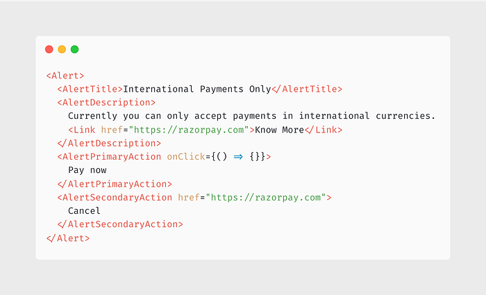
This API is extremely flexible. Where users can literally change anything and everything they want to.
- Users can change the order of any of the JSX elements like AlertTitle, AlertDescription, PrimaryAction, SecondaryAction
- Users can add any random JSX inside the AlertDescription
- Users can pass href or onClick to the action buttons and it will render accordingly
Basically, consumers can do anything and in a design system this can be problematic depending on where you want to be in “The Spectrum”.
Let’s change the API to be more constrained now:
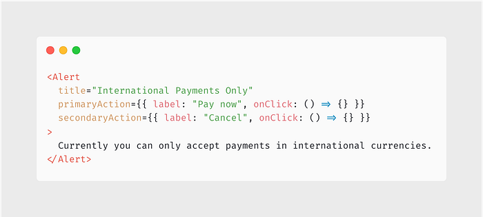
There you have it. Now users can only have control over a few things and as a design system, we are being more consistent and constrained.
- Users are now bound to provide strings for the title and description.
- Users cannot reorder any JSX elements as they like.
- Users cannot mess up the primary and secondary action buttons.
- Users cannot change any styling.
It all depends on where you want to be In “The Spectrum”,
Blade sits on the far right of the spectrum and is more constrained and AdaptUI sits on the far left which is more flexible.
Lesson 3: Low-Level APIs, High-Level Abstractions
I love the idea that you build low-level APIs/Primitives and using them as a foundation, you can build high-level abstractions.
Surma has a beautiful article about this topic where he talks about “Layered Architecture”
IMO this is a great way to architect your design system components if you are at least sitting somewhat close to the middle of “The Spectrum” or you can even be in a superposition of flexibility and constraint by exposing those low-level APIs to the user.
I learned about this pattern while I was working on AdaptUI, where our whole architecture was built around the notion of reusable hooks and primitives which can then be used to create higher-level abstractions. We even had two repositories — one which holds the primitives and core component logic (AdaptUI/react) and then the actual design system (AdaptUI/react-tailwind)
I’ve talked about this pattern in detail in this interview at SurviveJS: Renderlesskit React — Collection of composable headless hooks — Interview with Anurag Hazra
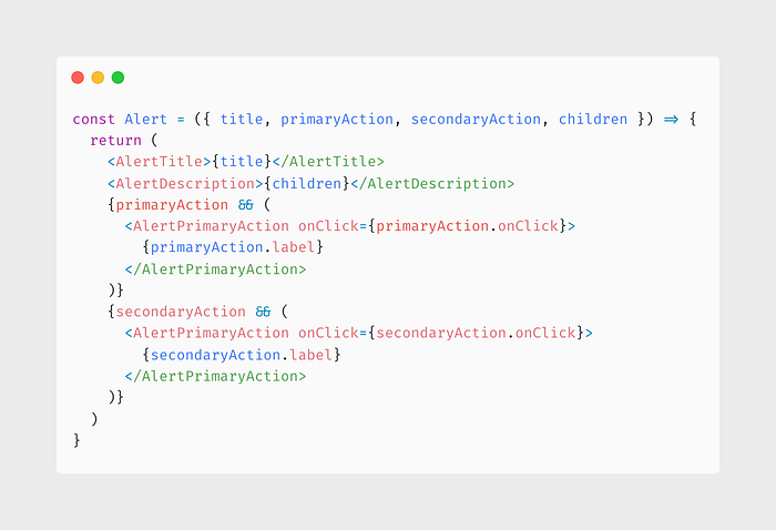
Let me show you a practical example. In lesson 2 we saw how the Alert API can be built with two different goals in mind, Flexible vs Constrained.
We can introduce the “Layered Architecture” in that component too.
We can build the flexible low-level API first and on top of that we can build the high-level API:
Blade is a different beast altogether because it is a multi-platform design system.
It isn’t just for the web but it also works seamlessly on native too (without react-native-web). And we have patterns/abstractions which we’ve built to provide the same developer experience and look and feel to our components.
Recently we wrote the API decisions for Checkbox which we released. While implementing it, we designed the architecture ahead of time to minimise the amount of effort to make it truly cross-platform. Thus internally we opted for a more low-level hook-based architecture for the Checkbox and built high-level abstractions on top of it.
See the Checkbox Architecture in this PR
We created useCheckbox & useCheckboxGroup low-level hooks which work seamlessly across both platforms and then we use them to create higher-level components for each platform.
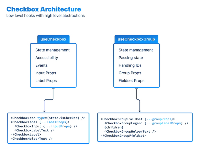
It’s a robust pattern.
Lesson 4: Accessibility
Probably the most important part of any design system or component library is ensuring Accessibility.
Building accessible components are hard. Therefore, baking accessibility right in the design system makes it easy for other developers/designers to build accessible products without much hassle, which in turn provides a better experience for the users.
But why is accessibility important?
At a surface level if your foundational components are inaccessible then the products that you build with those foundations will naturally result in an inaccessible experience for the users. But there’s more to it than that
Making our products accessible is important for two reasons:
- It’s the right thing to do. We believe that everyone deserves to be able to use our products, regardless of their abilities.
- It’ll help build trust with our customers. By making our products accessible, we can expand our potential customer base and make our products more appealing to a wider range of people.
In 2020, A 29-year-old banker who is visually impaired opened 2 petitions to make popular delivery apps accessible because they couldn’t order from them due to their inaccessible apps. Over 15,000 & 27,000 people signed the petition. Later these apps listened to the people and improved their accessibility.
Following APG patterns, testing accessibility, and ensuring that components work with the keyboard as well as screen readers is crucial for a component library since these are the foundations which will be used to build the products, A case study by W3C shows that building accessible digital products also have a positive business impact.
At Razorpay we ensure that our products are accessible to as many people as possible, hence for Blade, we wrote a detailed Accessibility RFC which covers most of the important parts of how we can build accessible components.
In Lesson 2, We talked about how API design can be hard. Turns out that you can even enforce Accessibility through good API design, and improve the developer experience.
For example, Say we have a Button component which can take an icon as a prop and the user can omit the children prop to make it look like an Icon only Button, but the problem is now the Button isn’t accessible to screen readers since it has no accessible label associated with it.
To solve this issue, we can leverage TypeScript to enforce that if the icon prop is present and the children prop is absent, make accessibilityLabel prop mandatory.
TypeScript playground example:
All in all, building accessible components is probably the most important lesson I learnt while tinkering with reusable components. It did not just help me build better components but also helped me be a better FrontEnd engineer by teaching me to care more about accessibility in general.
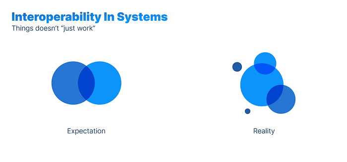
Lesson 5: Interoperability isn’t free
While building Blade we’ve realized that building frameworks which are truly cross-platform is hard. We expect things to “just work” but in reality, some parts are scattered and disconnected from the system.
Building components in a way that works on both platforms seamlessly is difficult, and more often than not it requires platform-specific code and special abstractions.
I’ve experimented with various ways to ease the process of creating cross-platform components and also proposed APIs like a polymorphic <Box /> component which can help us build these components.
As you may have noticed this pattern goes hand in hand with Lesson 3, where we talked about low-level APIs with high-level abstractions, Where low-level APIs can be used to create high-level components that are truly cross-platform.
Though In blade for now we took the simplified approach to only have a simple internal <Box /> component since the above approach still has more than a few edge cases to handle.
Fin
Building design systems and designing complex APIs are very interesting challenges in themselves. While we continue to evolve and improve Blade we hope that you find some of these learnings useful. That’s all.
Checkout:
Come Work With Us 🚀
If the work we do excites you, we are actively hiring for our engineering team. We are always looking out for great folks. Reach out to us at tech-hiring@razorpay.com or head over to our jobs page.

